

My Work
Editorial & UX Design – SHIFT Research Project
Context
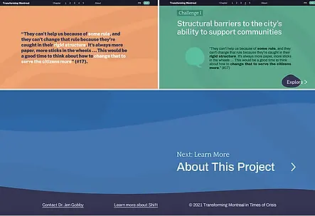
The SHIFT Research Project is a bilingual initiative developed for the SHIFT Center for Social Transformation, exploring how cities evolve during times of crisis. The project required both a digital and editorial format to present complex research in a clear and accessible way.
Objective
To design a cohesive visual experience across digital and print platforms, making dense research content easy to navigate, read, and understand for a broad audience.
My Role
I designed website mockups in Figma and a full multi-page report in both English and French. My work focused on creating structured layout systems, establishing clear typographic hierarchy, and ensuring visual consistency across all formats.
Outcome
The final design delivers a clean and accessible experience, improving readability and user navigation. By maintaining a unified visual system across both the website and the report, the project ensures consistency while effectively communicating complex information.
Digital Experience (Figma)
Website mockups designed to present research content in a clear, structured, and user-friendly format.

Main page
Navigation

Color Palette and fonts

Layouts
Editorial Report (PDF)
A bilingual report designed for digital distribution, focusing on readability, structure, and consistency across a large volume of content.
View full Report:
Design Approach
The project was guided by a focus on clarity and accessibility. A structured layout system and consistent typographic hierarchy were used to support long-form reading and improve navigation across both digital and editorial formats.
TED on Cars – Campaign & Website Redesign
Context
This project reimagines the digital presence of a TED on Cars focused on future mobility and innovation in the automotive industry, expanding its reach across multiple platforms.
Objective
To redesign the website experience while developing a cohesive visual direction for supporting campaign content across social and video platforms.
My Role
I redesigned the website interface and developed visual assets inspired by the existing TED on Cars brand, including social media and video-based content to create a consistent and engaging campaign experience.

Video Content
Promotional video content designed to support the campaign and increase engagement across digital platforms, including YouTube and Instagram.

Youtube video

Instagram Reel
Design Approach
The project focused on creating a clear and engaging visual direction inspired by the existing TED on Cars brand. Emphasis was placed on strong visual hierarchy, bold imagery, and consistency across digital platforms to effectively communicate the topic and capture user attention.
Art Souterrain – Wayfinding & Event Design
Context
Art Souterrain is a large-scale public art festival in Montreal, requiring clear and accessible visual communication to guide visitors through multiple underground locations.
Objective
To design a cohesive wayfinding system and supporting visual materials that enhance navigation and improve the overall visitor experience.
My Role
I designed a series of maps and banners to guide visitors between locations and present key information about artists and exhibitions. I collaborated closely with the communications team, designers, and artists to ensure clarity, consistency, and alignment with the festival’s visual identity.
Outcome
The final deliverables improved navigation across the event while maintaining a clear and consistent visual system across multiple touchpoints, supporting both usability and the overall experience.
Wayfinding Maps
A series of 15 maps were designed to guide visitors across multiple underground locations, ensuring clarity and consistency throughout the event.


Event Banners / Posters

Event Poster
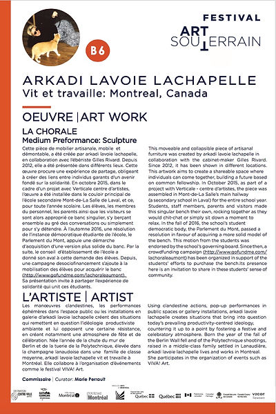
A standardized poster system designed and adapted across 50+ artists, ensuring consistency while accommodating varying content.
Design Approach
The project focused on clarity, accessibility, and consistency across all materials. A structured layout system and clear typographic hierarchy were used to ensure information was easy to read and navigate within a complex, multi-location environment. The visual system was designed to scale efficiently across multiple formats while maintaining a cohesive identity throughout the event.
Creative Exploration
A selection of personal work combining painting, drawing, and digital techniques, exploring composition, color, and visual expression


